Resources Used In This Tutorial
- Cloudy Sky
- Grassy Field
- Old Boots
- Roof Image
- Door
- Bell Photo
- Chimney
- Wooden Beams
- Big Ben Clock
- Circular Window
- Door Mat
- FanExtra Premium Brush Set: Clouds
- Free Grass Brush Set
- Girl Sitting
- Girls Running
- Red Balloon
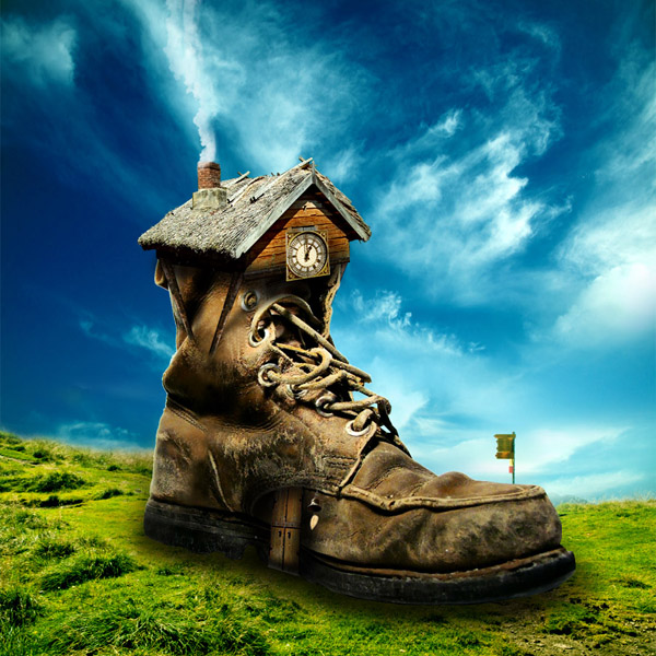
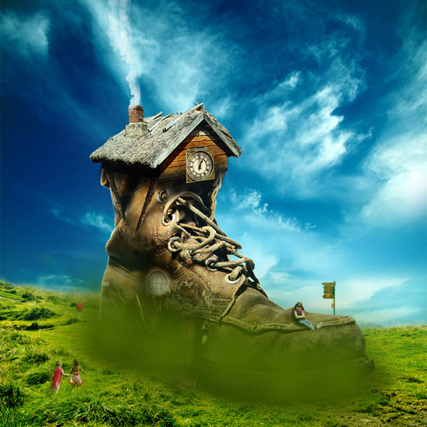
Final Image
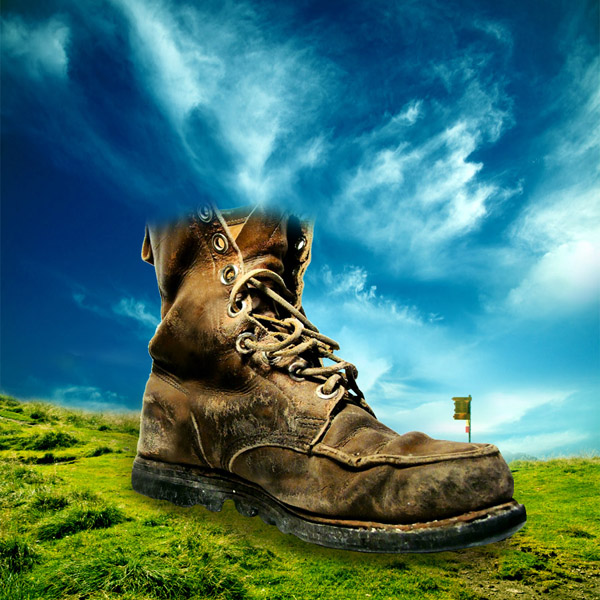
Here is a preview of the image that we are going to be creating:

Step 1
Create a new document (900X900px).
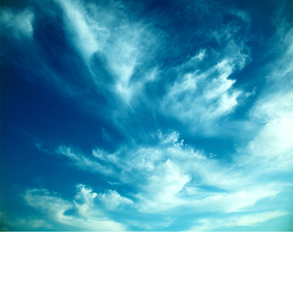
Open the ‘cloudy sky’ photo in the resources section for this tutorial.
Paste the sky into the top part of your canvas. I used the transform scaling box to make the height of this sky a little taller, filling more of the canvas:

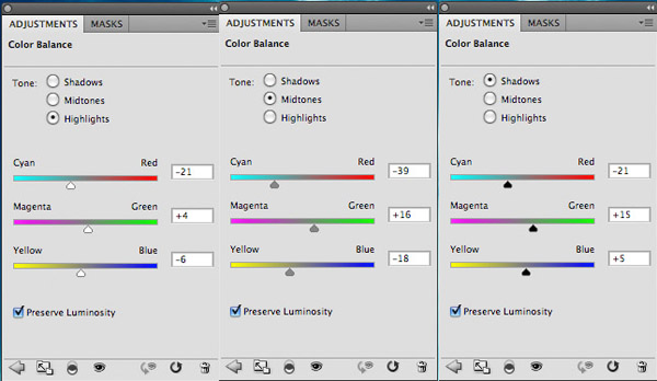
Apply a color balance adjustment layer, being sure to give you adjustment layer a clipping mask. (Apply a clipping mask to all adjustment layers unless otherwise specified).
Color Balance Adjustment Layer Settings:
Highlights: -21 / +4 / -6
Midtones: -39 / +16 / -18
Shadows: -21 / +15 / +5
Midtones: -39 / +16 / -18
Shadows: -21 / +15 / +5
Step 2
Open the ‘grassy field’ image from the resources section for this tutorial.
Paste the image into your original document and position it at the bottom part of your canvas:

Apply a layer mask and use a soft, black paintbrush to mask off the top of your grassy field image. The idea is to let it look as if the underlying sky image is the actual sky for this scene.
Be sure to keep the sign post area in tact and don’t mask this off:

Apply a levels and color balance adjustment layer to your green field layer:
Levels Adjustment Layer Settings:
19 / 1.00 / 236
Color Balance Adjustment Layer Settings:
Highlights: -16 / -8 / -26
Midtones: -22 / +4 / -4
Shadows: -4 / +26 / -25
Midtones: -22 / +4 / -4
Shadows: -4 / +26 / -25


Step 3
Open up the ‘old boots’ image from the resources section for this tutorial. Cut out one of the boots using your preferred selection method and paste it into your original document, positioning it like this:

We want to get rid of the large lace hanging down the side of the boot. You’ll also notice a small light patch on the bottom left of the soul. This was the second boot in the original image, and we want to get rid of this area too.
Use the clone stamp tool to clone over these areas. Start by option+clicking on your boot layer to select it. The marching ants active selection around your boot will mean that non of your cloning efforts will go outside the edges of your boot shape.
Then proceed to use your clone stamp tool like normal to clone out areas of your boot:

You can see the result of the cloning process below. I also applied a layer mask and masked off the top of the boot using a large, soft black paintbrush (you’ll see why later in the tutorial):

Apply a levels and color balance adjustment layer to your boot layer:
Levels Adjustment Layer Settings:
9 / 0.95 / 244
Color Balance Adjustment Layer Settings:
Highlights: -5 / +6 / +2
Midtones: +16 / +11 / +16
Shadows: -11 / +1 / -9
Midtones: +16 / +11 / +16
Shadows: -11 / +1 / -9


Step 4
Create a new layer underneath your boot layer called ‘shadow under boot’.
Use a medium sized, soft black paintbrush (around 20% opacity) to build up a shadow between your boot and the ground:
Create a new layer ABOVE your boot layers and call this ‘shadow bottom of boot’.
Apply a further shadow underneath your bottom area, but this time overlap the bottom of your boot slightly, blending the boot into the shadowed area:

Step 5
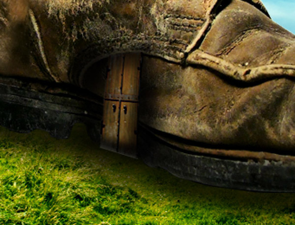
Open up the ‘door’ image from the resources section for this tutorial. Select the door using your preferred selection method and then paste it into your original document.

Go to edit>transform>distort and distort your door so that it fits better with the edge of your boot:

Apply a levels, hue/saturation and color balance adjustment layer to your boot layer:
Levels Adjustment Layer Settings:
23 / 0.93 / 241
Hue/Saturation Adjustment Layer Settings:
0 / -20 / 0
Color Balance Adjustment Layer Settings:
Highlights: -56 / -29 / -11
Midtones: -30 / -9 / +12
Shadows: -32 / -6 / +5
Midtones: -30 / -9 / +12
Shadows: -32 / -6 / +5


Step 6
Right now our door is looking a little flat and not really part of our boot’s structure.
To fix this, create a new document called ‘shadow over door’.
Use a soft, black paintbrush to paint around the edges of your door, creating the effect than the door is concave into the structure of your boot:
Download the ‘bell photo’ image from the resources section for this tutorial.
Cut it out from it’s background and paste it into your original document.
Position and resize the bell to fit next to your doorway. The colors are already pretty well blended with your surrounding composition, so no adjustments needed just yet:

Step 7
Open up your ‘roof’ image from the resources section for this tutorial.
Extract the roof part of the image from it’s background and paste this into your original document.
The roof is roughly at the right angle, so just use your basic transform tools to manipulate it very slightly to fit the top of your boot better:

Apply a levels and color balance adjustment layer to your roof layer:
Levels Adjustment Layer Settings:
22 / 0.81 / 247
Color Balance Adjustment Layer Settings:
Highlights: +12 / +2 / -2
Midtones: -25 / +6 / -1
Shadows: +12 / -6 / -8
Midtones: -25 / +6 / -1
Shadows: +12 / -6 / -8


Step 8
Create a new layer called ‘shadow over roof area’. Use a soft black paintbrush to shadow the bottom part of your roof and the top part of your boot. This should help blend them better together.

Step 9
Open up the ‘wooden beams’ image from the resources section for this tutorial.
Select one of the beams using your preferred selection method and copy/paste it back into your original document.
The colors of the beam are pretty well blended already with the rest of our composition, so no adjustments are needed for now.

Duplicate the beam several times. Resize and transform each beam to fit as a support for your roof structure:
Add a further beam to sit horizontally underneath your roof.
Then create a new layer called ‘shadows blending beams’. Use a soft black paintbrush to add shadows to the top of your beams, blending them better with your roof area.
Finally, apply a layer mask to each of your beam layers. Use a soft black paintbrush to mask off the bottom of each beam, blending it into the leather of your boot:

Step 10
Create a new layer beneath your beams called ‘beam shadows’.
Use your lasso tool and paintbucket tool to create some rough black shadows where you anticipate the shadows cast by your beams to go:

Reduce this layer’s opacity to around 55%, and then go to filters>convert for smart filters. This will allow you to apply filters not destructively. Now go to filters>blur>gaussian blur.
Apply a 3.5 pixels strength gaussian blur:

Step 11
Open up the big ben clock image from the resources section for this tutorial.
Extract the clock part of the tower, and the square frame surrounding it. Paste this into your original document:

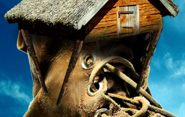
You’ll notice that the clock isn’t the right angle to fit with our rooftop right now. This is a pretty easy fix. Simply go to edit>transform>distort and distort your clock until it looks like the image below:

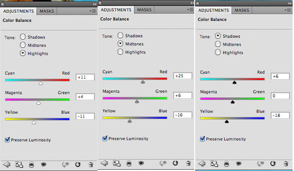
Apply a color balance adjustment layer to your clock layer:
Color Balance Adjustment Layer Settings:
Highlights: +11 / +4 / -11
Midtones: +25 / +6 / -16
Shadows: +6 / 0 / -18
Midtones: +25 / +6 / -16
Shadows: +6 / 0 / -18
I also created a new layer called ‘shadow clock’ and used a soft, low opacity black paintbrush to add some additional shadow around my clock:

Step 12
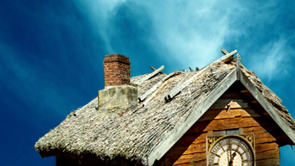
Time to add a chimney to our roof!
Start by opening the ‘chimney’ image in the resources section for this tutorial.
Extract the chimney and paste it back into your original document.
Position the chimney over your roof, and use a layer mask to mask the bottom of the chimney smoothly into your roof area (using a soft black paintbrush for this):

Apply a levels and color balance adjustment layer to your chimney layer:
Levels Adjustment Layer Settings:
20 / 0.79 / 240
Color Balance Adjustment Layer Settings:
Highlights: +16 / +11 / -9
Midtones: -13 / -6 / -9
Shadows: +4 / 0 / -8
Midtones: -13 / -6 / -9
Shadows: +4 / 0 / -8

Step 13
Download the ‘FanExtra premium brush set: Clouds’ brush set from the resources section for this tutorial.
Create a new layer called ‘smoke’.
Select one of your cloud brushes and use a white paintbrush to give the impression of smoke rising up from the chimney of the house:

To make the effect slightly more subtle apply a layer mask and use a low opacity, soft black paintbrush to mask off areas of your smoke:
Step 14
Now paste in your ‘window’ image from the resources for this tutorial.
Apply a layer mask and use a soft black paintbrush to mask off the area around your window, blending it more smoothly into your boot’s surface:

Apply a color balance adjustment layer to help blend the colors of the window better:
Color Balance Adjustment Layer Settings:
Highlights: +2 / -4 / -2
Midtones: +29 / +12 / -4
Shadows: +21 / +9 / -15
Midtones: +29 / +12 / -4
Shadows: +21 / +9 / -15

Step 15
Add some additional lighting and shadowing to your window.
Use a soft, low opacity black paintbrush to paint in shadows around the left edge of your window.
Then use a soft, low opacity yellow/orange brush to give a subtle tint of light coming out of the window:

Step 16
Cut out and paste in your doormat image from the resources section for this tutorial.
You will need to go to edit>transform>distort to distort the mat to fit nicely in front of your door:

Apply a levels, hue/saturation and color balance adjustment layer (in that order).
Levels Adjustment Layer Settings
23 / 0.89 / 224
Hue/Saturation Adjustment Layer Settings:
Hue: 0
Saturation: -55
Lightness: -25
Saturation: -55
Lightness: -25
Color Balance Adjustment Layer Settings:
Highlights: +1 / +4 / -9
Midtones: -2 / -4 / -11
Shadows: -5 / +1 / -6
Midtones: -2 / -4 / -11
Shadows: -5 / +1 / -6


Step 17
To help blend your doormat better, create a new layer called ‘shadow doormat’.
Use a soft black paintbrush to paint in shadows between the doormat and the door, as well as underneath and to the sides of the mat a little.

Download the free grass brush set from the resources section for this tutorial.
Create a new layer called ‘grass’. Use your eyedropper tool to sample a shade of green from the surrounding grassy area. Use several of your grass brushes to create areas of grass that overlap your welcome mat.

Step 18
Copy/paste in the image of the girl sitting from the resources section for this tutorial. Position her so she is sitting on the end of the boot:

Adjust the colors of the girl very very slightly just to fit better with the surrounding composition.
Then create a new layer called ‘shadow under girl sitting’.
Use a soft, mid-opacity black paintbrush to brush a shadow under the girl and slightly covering her right side. This makes it look more realistic that she is actually sitting on top of the boot:

Step 19
Paste in the ‘running children’ image from the resources section for this tutorial:

Apply a color balance adjustment layer. You should aim to make the grass in your ‘running children’ image match the lightest grass in your main composition.
Color Balance Adjustment Layer Settings:
Highlights: +8 / +35 / -16
Midtones: +13 / +40 / -23
Shadows: +9 / +13 / -26
Midtones: +13 / +40 / -23
Shadows: +9 / +13 / -26


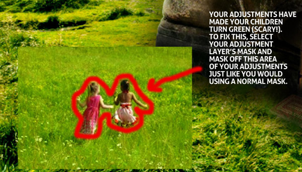
You’ll notice that whilst your color balance adjustment layer has turned your grass a nice color, it’s also made your children green. To fix this, simply mask off this area of your adjustment layer, just like you would a normal mask. Simply select the mask attached to your adjustment layer and use a black paintbrush to paint over your children, thus returning them to their original, non-adjusted color:
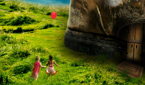
Now select your ‘running children’ layer and mask off the edges of the image until you’re left with just your children and a little blending grass surrounding them:

Step 20
Copy the ‘red balloon’ image from the resources section for this tutorial into your original document.
Option+click on this balloon layer to select your balloon shape. With your selection active create a new layer called ‘balloon shadow’. Use a soft, low opacity black paintbrush to paint a shadow on the left/bottom side of your balloon, making it more rounded:

Create a new layer called ‘string’.
Select your paintbrush tool, and select a 1px, white paintbrush at 55% opacity. Use your path tool to create a wavy path dangling down from your balloon. In your paths palette right click on your path and click ‘stroke path’, selecting ‘paintbrush’ as the stroking option.
This should stroke your path line with a 55% opacity 1px white line. This is an easy way to create a simple balloon string:

Step 21
Time to start adding some final lighting and adjustments to our piece.
Create a new layer called ‘blue lighting’. You want to give the impression of some of the blue of our sky bleeding across into the boot/grassy areas. This should give the impression of various light sources in the piece effecting one another.
Use a large, soft paintbrush tool (69cbe1) to create a series of soft blue spots along the edges of your boot and grass:

Reduce this layer’s opacity to 10% to make the effect more subtle:

Repeat the same steps on a new layer called ‘green lighting’. This time paint green (456300) light spots along the bottom of your shoe, as if the green from your grass is casting this color upwards:
To make the effect more subtle change this layer’s blend mode to ‘overlay’ and reduce it’s opacity to 20%:

Step 22
If you check out the image below you’ll see that our sign post is a strange color. This is caused by the original adjustments on our ‘grassy field’ layer.

To fix this we could always mask off that area of our original color balance adjustment layer. However, we want even more control over our sign color than that!
Create a new hue/saturation adjustment layer (DO NOT APPLY A CLIPPING MASK TO THIS ADJUSTMENT LAYER).
Apply the settings shown below:
Hue Saturation Adjustment Layer Settings:
Hue: 0
Saturation: -55
Lightness: +10
Saturation: -55
Lightness: +10
This will cause your sign to become a nicer color, but will also reduce the saturation of the rest of your image, which you don’t want!
To fix this, select the mask associated with this adjustment layer. Fill your entire canvas with black (thus masking off your entire adjustment layer). Then go in with a white paintbrush and paint over your sign area.
This will reveal your hue/saturation adjustments, but only in this specific area, as your reveal your adjustment layer’s mask.
And there you have it, safe, non-destructive blending, with plenty of control!

Step 23
To give a slightly more fantasy look to our piece we’re going to apply a dodge/burn layer.
Create a new layer called ‘dodge/burn’. Change this layer’s blend mode to ‘overlay’.
Then use a soft, low opacity black paintbrush to burn your image, and a soft, low opacity white paintbrush to dodge it. You should aim to create a more unified light source, accentuate shadows/highlights where appropriate and just generally bring the feel of your piece together more:

Step 24
As a final adjustment apply a gradient overlay adjustment layer (DO NOT APPLY A CLIPPING MASK TO THIS ADJUSTMENT LAYER).
Select the default gradient overlay ‘orange, yellow, orange’.
Reduce this layer’s opacity to 2%.

And We’re Done!
You can view the final outcome below. I hope that you enjoyed this tutorial and would love to hear your feedback on the techniques and outcome.
No comments:
Post a Comment